Gmail’s New Logo, Bye Envelope
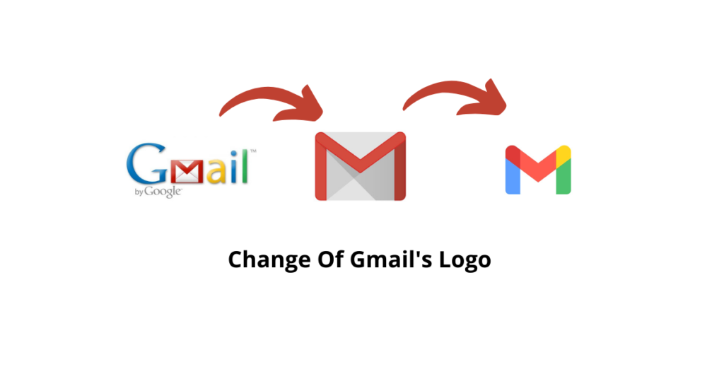
Early this month of October 2020, Google Changed the logo of Gmail and all the services belonging to its workspace fleet. Gmail’s classic Red White envelope is gone. It was in existence from about a decade. It was in the existence from the day of the dial-up network era. Days went by but the logo remains the same till September 2020. And finally, Google changed the Gmail logo.

Google changed it to a new M logo made out of the Google core blue, red, yellow, and green brand colours. Not only Gmail it almost changes all its app’s logo. A huge part of it covered by Red, Blue, Green and only have a bit of yellow in it. It seems to google changed all the logos to the solid type logos not only Gmail. Google has changed all its app’s logo to similar kinds of solid type logos.
Google may be trying to improve the connectivity in between apps and to pull all the things into a centre. Google has already added meet into the Gmail app to get going with one app.
From the logo, it might look a small change. But, Google made a lot of changes to Google G Suites and Changes name to Google Workspace. A lot to come which seems like google is working on.
It seems like we might be looking at some bigger changes in the near future. Google might be doing this to compete with Microsoft. After seeing the success of Microsoft Teams. Google is working hard to provide a new improved experience to the people working from home. Even added some new small features and integration in recent months.
So let’s see will the people who work from home be getting a bit of more comfort or not. Whether if the businesses are going to get more information and connectivity or not.

Pingback: Google Suite evolved to Google Workspace - TechStuck